
Reducing a 90% Drop-Off by Reframing the Digital Sales Experience
Contribution: UX Design,
UI Design
The Problem
The company’s digital sales experience relied on a traditional lead form containing over 20 required fields and sales representatives to complete telecom plan purchases. Funnel analytics showed over 90% of users abandoned the process at the form stage, making it the most significant point of friction in the digital experience.
While the length of the form contributed to the drop-off, the deeper issue was a mismatch between user expectations and the digital workflow. Users arriving on the website expected to complete their purchase online, but the experience instead redirected them into a delayed sales-assisted process.
This disconnect created frustration and significantly reduced conversion.

Design Constraints
Balancing a streamlined user experience with complex telecommunication industry requirements was the core challenge of this project:
-
Regulatory Compliance: Navigating strict telecommunications disclosures and structured data mandates
-
Operational Continuity: Integrating the new flow with legacy infrastructure and backend workflows
-
Global Scalability: Ensuring the interface remained intuitive and functional for diverse international customers.
These constraints meant the solution had to reduce friction without removing required data fields or disrupting operational processes.
Design Decisions
Journey mapping and behavioral analysis revealed that the 20+ field lead form and sales-assisted model were major friction points. To create a effortless checkout experience, I moved away from "optimizing fields" to fundamentally reframing the digital interaction.
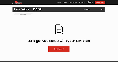
Before

After

The "Guided Conversation" Model
The Problem: Users were overwhelmed by a long, administrative lead form, creating a high psychological barrier to entry.
The Solution: I transformed the static form into a multi-step, narrative flow to build completion momentum.
-
Chunking: Grouped 20+ inputs into 4 logical categories (Profile, Delivery, Travel Plan, and Review)
-
Progressive Feedback: Added real-time progress indicators to reduce perceived effort.
-
Contextual Microcopy: Used conversational labels to guide users through complex telecom terminology.
The Impact: Significant drop in abandonment during the initial information-entry phase.
Reducing Cognitive Load via Progressive Disclosure
The Problem: Presenting all fields simultaneously caused decision fatigue and early drop-off.
The Solution: Applied progressive disclosure to keep the interface clean and focused.
-
Conditional Logic: Only revealed secondary inputs (e.g., "delivery options") if the user selected a relevant primary service.
-
Task Focusing: Limited each screen to one primary action, ensuring the user stayed focused on the current step without being distracted by future requirements.
Balancing Compliance
with Modern UX
The Problem: Strict telecom regulations required specific data collection and legal disclosures that couldn't be deleted.
The Solution: Modernized the interaction without disrupting backend data integrity or operational workflows.
-
Strategic Deferment: Moved non-immediate data collection to post-conversion "Thank You", follow-ups and onboarding pages.
-
Data Mapping: Ensured all front-end inputs mapped directly to existing sales team CRM structures to avoid operational friction.


Validation & Rollout
To overcome stakeholders’ initial resistance to replacing the traditional sales method, I built a data-backed transition plan:
-
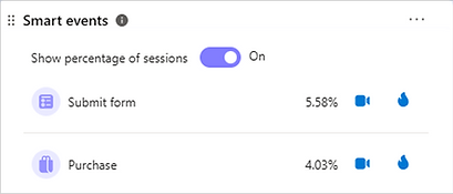
Utilized GA4 funnel exploration, Clarity smart event tracking and usability testing to pinpoint legacy bottlenecks and prove the new solution’s efficiency.
-
Executed a soft launch via a targeted marketing campaign to monitor performance
-
Following a successful pilot, it expanded to the global website and additional sales channels

Results
The redesigned experience transformed the digital channel from a lead-gen tool into a high-performance sales engine:
-
Conversion: Abandonment dropped from 90% to 20%
-
Efficiency: Decreased order placement time from over 14 hours to under 5 minutes
-
Operational Impact: Reduced workload on sales team and customer service team
